How To Design An Advert For The London Underground

Introduction
Designing an effective advertisement for the London Underground requires careful consideration of several key factors.
In this blog, we’ll provide some tips and best practices for creating a successful campaign that will catch commuters’ attention and deliver your message effectively.
Consider Your Audience
The first step in designing an advert for the London Underground is to understand your audience.
London commuters are a diverse group, ranging from busy professionals to families and tourists.
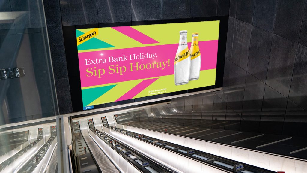
Consider the demographic you’re trying to reach, and tailor your message and design accordingly. For example, if you’re targeting families, you might want to use bright colours and playful imagery to capture their attention.
Keep it Simple
When designing an advert for the London Underground, it’s important to keep your message simple and concise.
Commuters are often in a hurry and have limited time to process information.
Your advert should convey your message quickly and effectively, using clear and easy-to-read text, bold graphics, and eye-catching imagery.
Incorporate a Call-to-Action
It’s important to include a clear call-to-action (CTA) in your advert.
Whether it’s directing commuters to your website, encouraging them to visit your store, or inviting them to try a new product or service, a CTA can help increase engagement and drive conversions.
Make sure your CTA is prominently displayed and easy to understand, and consider offering a special promotion or incentive to encourage action.
Use High-Quality Imagery
Visual appeal is essential when designing an advert for the London Underground. Make sure to use high-quality imagery that will capture commuters’ attention and draw them in.
Use bright colours and bold graphics to make your advert stand out, and avoid cluttered designs that can be overwhelming or confusing.
Consider Your Placement
The placement of your advert is also critical when designing an effective campaign for the London Underground.
Consider the location of your advert within the station, as well as the angle and distance from which it will be viewed. If your advert will be viewed from a distance, make sure to use bold, high-contrast text that will be easily legible.
Keep it On-Brand
Finally, it’s important to ensure that your advert aligns with your brand’s overall messaging and image.
Use consistent branding elements such as colour schemes, logos, and typography to create a cohesive campaign that reinforces your brand’s identity. A strong brand identity will help your advert stand out and make a lasting impression on commuters.
Conclusion
In conclusion, designing an effective advert for the London Underground requires careful consideration of your audience, messaging, and visual appeal.
By keeping your design simple, using high-quality imagery, considering your placement, and staying on-brand, you can create a successful campaign that will capture commuters’ attention and deliver your message effectively.
Recent Posts & News
- How to advertise on the London Underground
 Discover the ultimate guide to advertising on the London Underground. Learn effective strategies to reach millions daily and boost your brand’s visibility.
 - 8 Effective Strategies for Tube Advertising
 In this blog, we’ll explore why station takeovers are a powerhouse of advertising, allowing brands to create unforgettable experiences and maximise their reach in one of the world’s busiest transit systems.
 - 7 Key Reasons To Consider Tube Advertising
 In this blog, we’ll explore why station takeovers are a powerhouse of advertising, allowing brands to create unforgettable experiences and maximise their reach in one of the world’s busiest transit systems.


